
A website can contain hundreds of pages without anyone, neither visitors nor search engines, finding what they are looking for. The problem rarely lies in the content itself. It is about how the pages are linked to each other and structured. Organizing a site’s layout means deciding which paths exist, which are prioritized, and which lead to a dead end.
Click Depth and Orphan Pages: What the Theoretical Structure Doesn’t Show
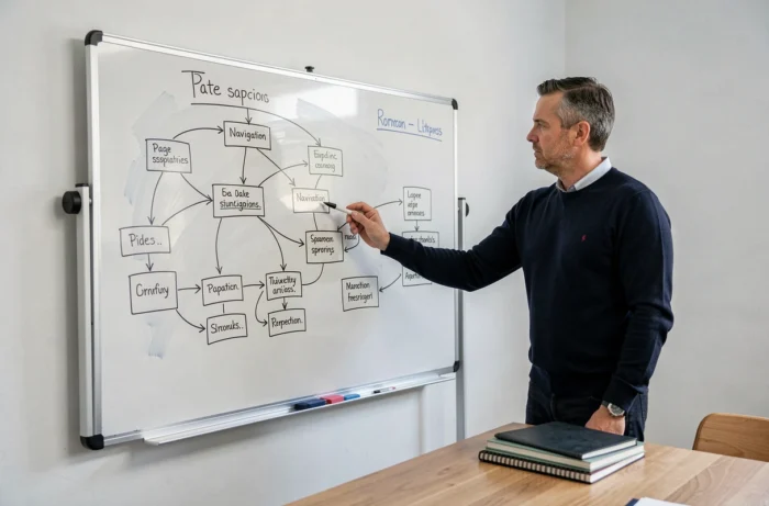
Most guides on site structure start with a tree diagram: homepage, categories, subcategories, final pages. This diagram is useful for visualizing an intention, but it does not reflect the reality of navigation.
What matters for a search engine as well as for a visitor is the actual click depth from the homepage. A page theoretically linked to a category but accessible only after five clicks will be little explored by indexing bots and almost never seen by a human.
The other common blind spot concerns orphan pages, those that exist in the CMS but receive no internal links. They are absent from the linking structure and thus invisible. A site plan audit should start with a technical crawl (using tools like Screaming Frog or Sitebulb) to identify these ghost pages, rather than with a tree diagram on a whiteboard.
To observe how a site map from Ma Première Formation presents its pages in a readable manner, one only needs to note that each URL is accessible without detours, which mechanically reduces navigation depth.
Mobile Navigation: Going Beyond the Hamburger Menu
Adapting a desktop menu into a hamburger icon on smartphones remains the default practice. Field feedback shows that this approach hides the site structure behind an additional gesture, which hinders exploration.
The most effective mobile interfaces now adopt fixed navigation bars at the bottom of the screen, combined with contextual tabs. This model, popularized by native applications, also applies to websites. It places frequent actions within thumb-accessible areas, without requiring the visitor to scroll back to the top of the page.
For the site map, this means thinking about the hierarchy in two levels visible simultaneously on mobile:
- A first level (four to five entries maximum) always displayed in the bottom bar, corresponding to the main sections of the site
- A second level accessible by lateral swipe or contextual menu, grouping the most consulted subcategories
- A third level relegated to the HTML site map or the internal search engine, for niche content
This logic forces choices. A site that tries to make twenty categories visible in mobile navigation does not prioritize anything.
Internal Linking and HTML Site Map: Two Complementary Tools
Internal linking (contextual links between pages) and the HTML site map (a page listing all URLs) serve different functions. Confusing them weakens both.
Internal linking serves to distribute authority among pages and guide the user journey. It works best when links are integrated into editorial content, with descriptive anchors. A link placed in a relevant paragraph carries more weight than a link lost in a footer of fifty entries.
The HTML site map, on the other hand, acts as a safety net. It ensures that every page of the site is accessible within two clicks maximum from the homepage. For sites with more than a few dozen pages, a well-maintained HTML site map significantly reduces the number of orphan pages.
What Google Changed at the End of 2024
Google removed the sitelinks search box (the internal search field displayed under certain results) in November 2024 and took down the associated documentation. The WebSite markup with SearchAction no longer generates this component in search results.
The direct consequence: key pages of the site must be accessible via navigation and classic sitelinks. Relying on the internal search exposed in Google to compensate for a blurry structure no longer works.

Menu Titles and Information Architecture: The Trap of Internal Jargon
An effective navigation menu relies on titles that the visitor understands before clicking. Field feedback varies on the appropriate number of entries in a main menu, but one point is consensus: ambiguous labels generate more bounce than long menus.
Some concrete principles for naming sections:
- Use the terms that visitors type into a search engine, not the internal vocabulary of the company (“Our synergistic solutions” says nothing, “Online Training” says everything)
- Avoid generic titles like “Resources” or “Services” without precision, which force the visitor to guess the content
- Test titles with a few real users before finalizing the structure, even informally
- Limit the depth of dropdown menus to two levels to avoid creating micro-labyrinths on hover
Information architecture is not limited to the main menu. Breadcrumbs, pagination links, “related articles” blocks, and the footer all contribute to the readability of the site map. Each navigation element must answer a simple question: where am I, and where can I go next.
A well-organized site map does not need to be spectacular. It must be consistent between what the visitor sees and what the crawler traverses. When these two realities diverge, neither SEO nor user experience benefits.